The internet is absolutely loaded with articles on typography. The subject has been discussed from all angles too, including its differences in the medium of print versus the web. The site Tutorial.vn discusses some of these differences. First and foremost, webpages serve as a source for information more than anything else, as opposed to print documents which can serve a whole spectrum of purposes. However, the tangibility between the two is the main difference; print documents are limited to whatever they can be physically printed on (i.e. business cards, posters, billboards). However, web type exists in a sort of meta-space that, to a degree, is limitless. However, because it is not an actual printed form, there is the element of the viewer itself that affects the visibility. Different people use different-sized screens, with different levels of brightness and contrast. Some people have slower internet providers as well, which can cause pages to load slowly. Browsers also integrate features of zooming and resizing and reloading fonts. These changes can force the webpages and type to be completely skewed and altered at the viewer’s discretion.
One of the biggest issues with THAT then is the limitation of fonts. While print can be, well, printed, web pages are meant to be viewed on a screen. This puts a limitation on the number of fonts used. If the person viewing the page doesn’t share the same font, it can’t be viewed. However, a work-around has come about using CSS3 to remedy this to a certain degree. CSS3 (as explained here) is a special form of CSS with a multitude of new functions. On of these functions give a potential fix to the font-limit.Tagged @font-face, this feature allows web designers to implement any font they’d like. Browsers can sometimes become a hindrance to using custom texts, but with a little working (such as from what is explained at BoldPerspective.com) these texts can even be made cross-browser so anyone can see no matter what they use. On an appnovation.com page discussing @font-face, they even included custom-font headings to show working proof of the functionality.

However, as explained on The Creative Project‘s blog, there is still a roadblock. Licensing is a steel ball-and-chain on a lot of type choices. Even if they may be available to run on a single person’s computer, restrictions encoded within the type may prevent it from being posted on the web. The @font-face tag is not a work-around for that.
The bright side to that then is that the creative gene has to be put to the test and designers might want to consider free fonts of unique custom fonts. While generally, it’s a little risky to gamble on them, the standard web-safe fonts are just that: standard and web-safe. Everyone’s seen them a million times. Using @font-face gives more freedom to a designer’s creativity. MyFonts.com has an enormous selection of fonts that are made specifically for the web, such as “Appetite”.

This display font is easy to read but has a little flair. It’s bold, like Impact, but isn’t as solid and lifeless. It’s multilingual too, which allows users in different countries to use this font and still get a beautiful effect.
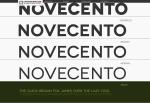
 If costs are an issue, nice free fonts can still be found. “Novecento”, much like “Appetite”, comes in a slew of languages, but this font also includes weights. It’s lighter forms are thin enough and sharp enough to be used as a body copy that’s a little less stale than something overused, like Arial. It also even comes from a well-designed page that includes examples and all the information you’d care to know about it.
Despite the hurdles web typography might pose, a little creative research will help a designer along.

Great content, but the thumbnails are virtually useless. I would also suggest adding sub-heads to your page to help facilitate a sense of hierarchy. Breaking up your content into smaller more scannable chunks will also increase the chance of someone reading your article. Graphically speaking, your page looks very dense.